Keywords: TRIOS, JSON, Python, Matplotlib
TB107
Abstract
This technical brief discusses how to use the matplotlib. pyplot library in Python® to visualize data. It complements TA Instruments™ TRIOS™ Software by enabling consistent visualization layouts and the ability to plot data from various instruments, not just thermal/rheological data. This note covers the basic information required for plotting data and is not intended to replace the extensive documentation for both Python and the matplotlib.pyplot library.
Note: The exported JSON files (DSC and MDSC), and the final Python scripts (Jupyter® format) used in this technical brief can be downloaded (Script 1, Script 2, and Script 3) here.
Introduction
The TRIOS Software instrument control and data analysis package offers numerous features for both routine and in-depth analysis of scientific data. However, you may sometimes need to generate uniform plot formats, overlay data from multiple sources, or apply advanced functions not available within TRIOS.
TRIOS Software has always supported data export in various formats, including plain text (ASCII), Comma Separated Values (CSV), and Excel™ workbooks. TRIOS Software version 5.8 introduced the ability to export data to a JavaScript™ Object Notation (JSON) file. The import of this JSON file into Python, and the creation and interaction with the dataframe, were discussed in previous technical briefs TB105 and TB106. This note will explore how to generate plots to visualize that data.
Matplotlib Library and Pyplot
Matplotlib is a comprehensive Python library for visualizing numerical data. The Pyplot functions allow Matplotlib and Python to work similarly to MATLAB.
To work with Matplotlib, it must first be installed and imported into the script. For installation, refer to the Matplotlib guides [1]. To import it into the script, you use the following command:

This allows you to call functions using the abbreviation plt. For example, to show the plot, you simply use:
Plotting Example 1: Heat – Cool – Reheat Data of Polyethylene Terephthalate (PET)
If running a heat-cool-reheat measurement, you may wish to plot all three cycles on the same axes. In this example, a sample of quenched cooled PET was run through the following method:
- Equilibrate 20.00 °C
- Isothermal 5.0 min
- Ramp 10.00 °C/min to 290.00 °C
- Isothermal 5.0 min
- Ramp 10.00 °C/min to 20.00 °C
- Isothermal 5.0 min
- Ramp 10.00 °C/min to 290.00 °C
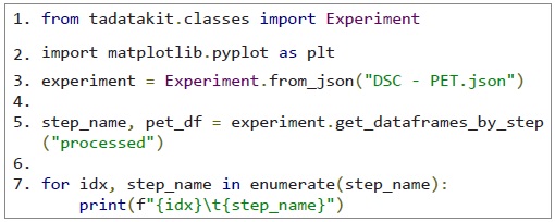
This data was then exported into a JSON file for import into Python. The first section of the Python script sets up the required libraries, imports the JSON file, and sets the dataframes for each step:
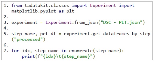
This script creates seven dataframes:
- pet_df[0]: Equilibrate 20.00 °C
- pet_df[1]: Isothermal 5.0 min
- pet_df[2]: Ramp 10.00 °C/min to 290.00 °C
- pet_df[3]: Isothermal 5.0 min
- pet_df[4]: Ramp 10.00 °C/min to 20.00 °C
- pet_df[5]: Isothermal 5.0 min
- pet_df[6]: Ramp 10.00 °C/min to 290.00 °C
The next code block will set up the plot. You have control over the plot’s appearance, including size, axes, signals, labels, and legend:
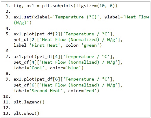
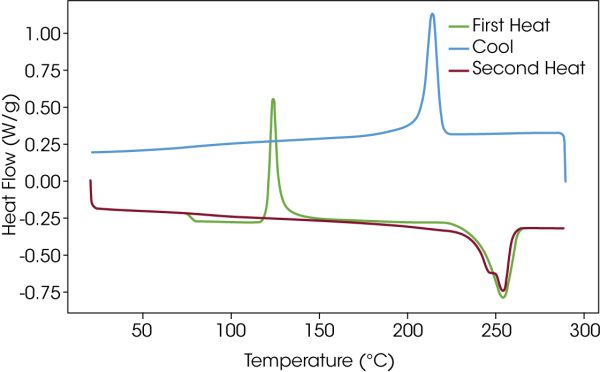
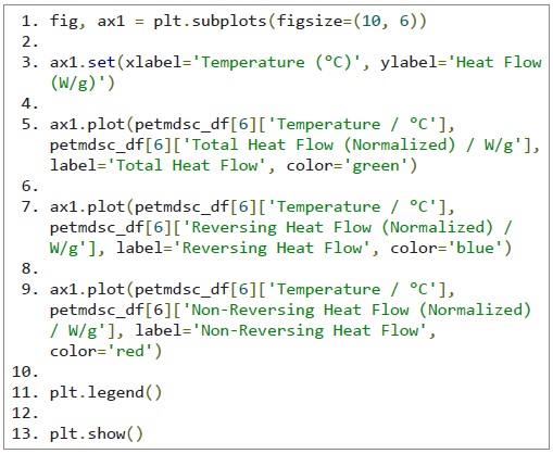
This script defines a plot with a size of 10 × 6 inches, labels for the axes, and plots three dataframes on the same axes. The plt. legend() command adds the legend, and plt.show() displays the plot as shown in Figure 1.
Plotting Example 2: Heat-ISO Modulated DSC of Polyethylene Terephthalate (PET)
In this example, separate signals on the same axes are plotted. The measurement method used was:
- Data Off
- Equilibrate 20.00 °C
- Modulate Temperature ±0.318 °C for 60.0 s
- Isothermal 10.0 min
- Data On
- Sample Interval 2.0 s/pt
- Ramp 2.00 °C/min to 290.00 °C
As with Example 1, the data was exported into a JSON file for import into Python. Again, the first section of the script sets up the required libraries, imports the JSON file, and sets the dataframes for each step:
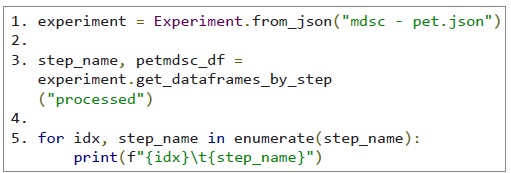
This script creates seven dataframes, but only the final dataframe (petmdsc_df[6]) contains numerical information. The plot code is like example 1, but calls different columns for each of the required signals:
Plotting Example 3: Heat-ISO Modulated DSC of Polyethylene Terephthalate (PET) – Separate Axes for Each Signal
With Modulated DSC™ data, it can be useful to view all signals on the same scale and on a maximum scale for each signal. This requires multiple y-axes but a common x-axis (temperature). The import of the JSON file and creation of the dataframe are the same as in Example 2. The visualization contains more detail and offsets the axes for visibility:
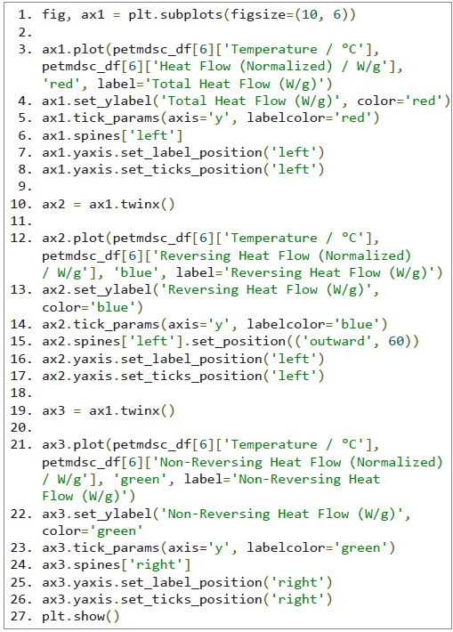
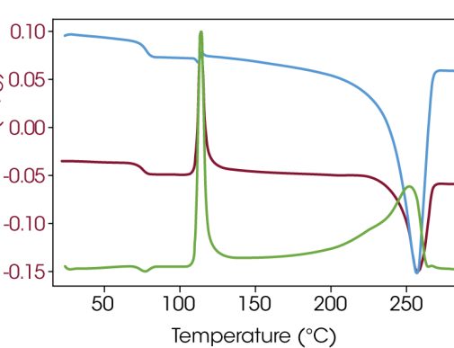
This script defines multiple y-axes with a common x-axis, using color to differentiate the signals as shown in Figure 3.
Conclusion
This technical brief looks at the options for plotting DSC data using the Python library Matplotlib.PyPlot. This use of Python allows consistent plotting for wide ranges of data which can be important when presenting data in publications.
Acknowledgement
This technical brief was written by Philip Davies, Principal Applications Scientist (Thermal Analysis)
For more information or to request a product quote, please visit www.tainstruments.com to locate your local sales office information.
Python is a registered mark of Python Software Foundation. Jupyter is a trademark of LF Charities, of which Project Jupyter is a part. Excel is a trademark of Microsoft Corporation, and JavaScript is a trademark of Oracle Corporation. Matplotlib are trademarks of NumFOCUS, Inc. TA Instruments, TRIOS, and Modulated DSC are trademarks of Waters Technologies Corporation.
Click here to download the printable version of this application note.

